COMMUNICATING BAD NEWS
A letter from an insurance company
by Eliot Mannoia // December 16, 2023
reading time: 5 minutes

© Suzy Hazelwood
How should you communicate bad news? We all get letters from companies, albeit fewer and fewer thanks to digitalisation and environmentally conscious factors. In the following, we discuss a case study.
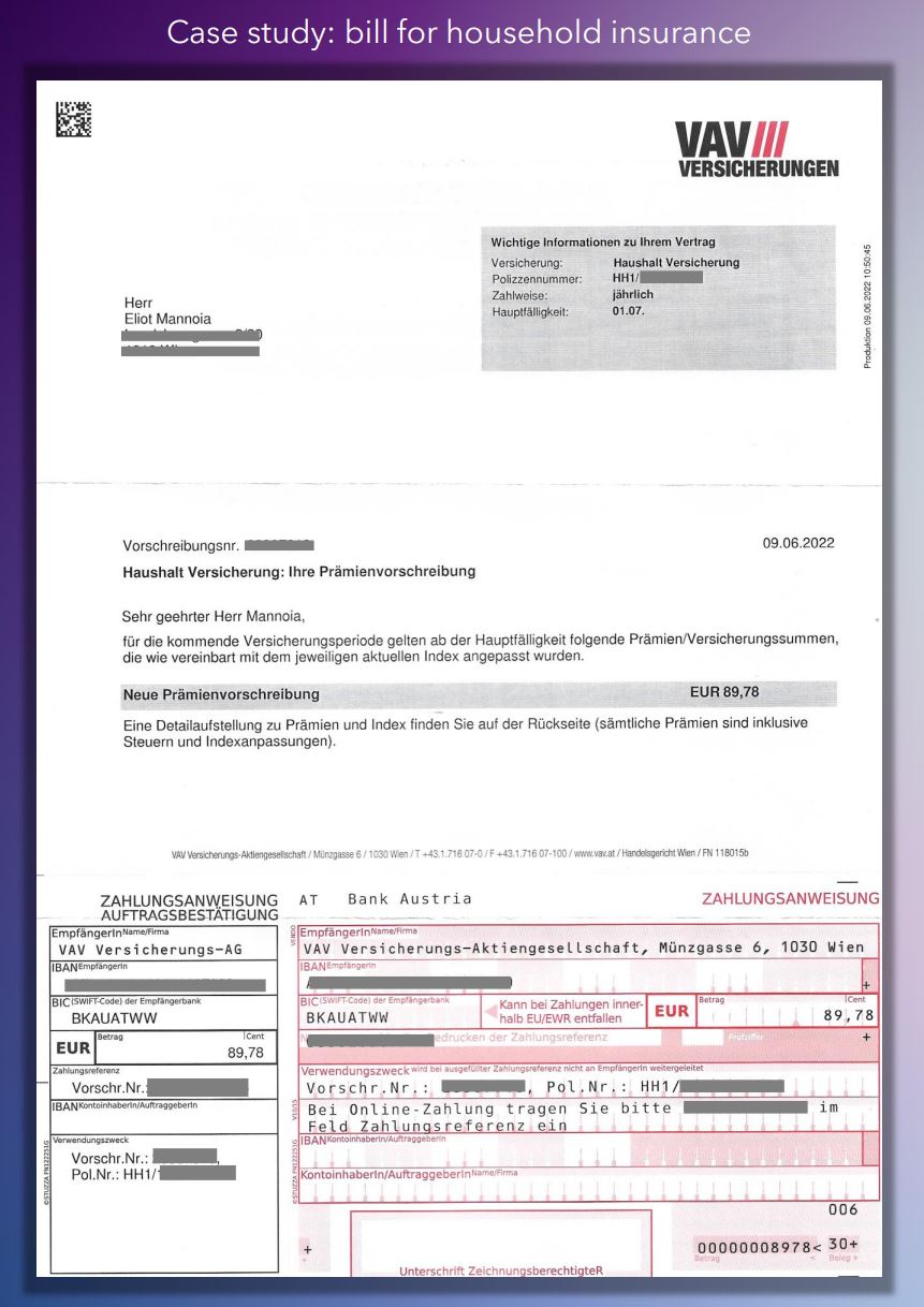
This is my insurance bill, informing me of what is due and that there has been a price increase. I get the bill once a year, and it’s the only touchpoint I have with them. Why would they not use this opportunity to build a relationship? Foster loyalty? Or try to up or cross sell me anything?
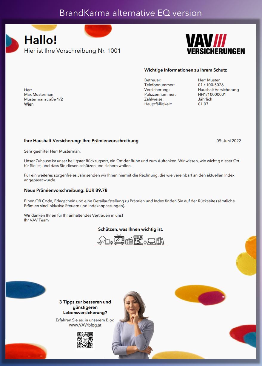
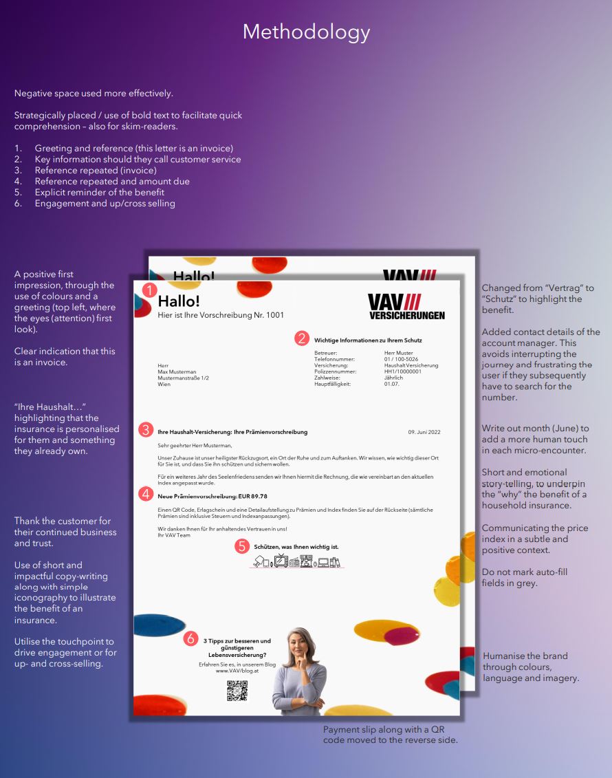
There is no emotional intelligence, no story-telling in this post-purchase touchpoint. Elements that would help given the bad news of the price increase.
Below you can see the original version, along with our revised mock-up. I think the difference is clear.


Sources:
The Hidden Traps in Decision Making (here)
Design principles (here)
Cognitive Biases (here)
Looking for Creativity: Where Do We Look When We Look for New Ideas? (here)
Visual Hierarchy: Organizing content to follow natural eye movement patterns (here)
Effective Use Of Negative Space In Web Design (here)
